Hongdae - Advertising Campaign
Branding
Adobe Illustrator | Adobe Photoshop | Adobe Animate
Overview
The goal of this project was to create outdoor advertisements for Hongdae, Seoul, South Korea, targeted to a young adult audience wanting to travel and to bring attention to the location. The brief detailed the concept, target demographic, deliverables, required sizing, as well as a sponsor. Our group assigned to this location developed a tagline for the advertising campaign, “Start with the Dae, End with the Night.” From there, we designed our advertising, following the brief given to us. The advertising included a logo, poster signage, lamppost banners, as well as an animated web advertisement.
Sketches
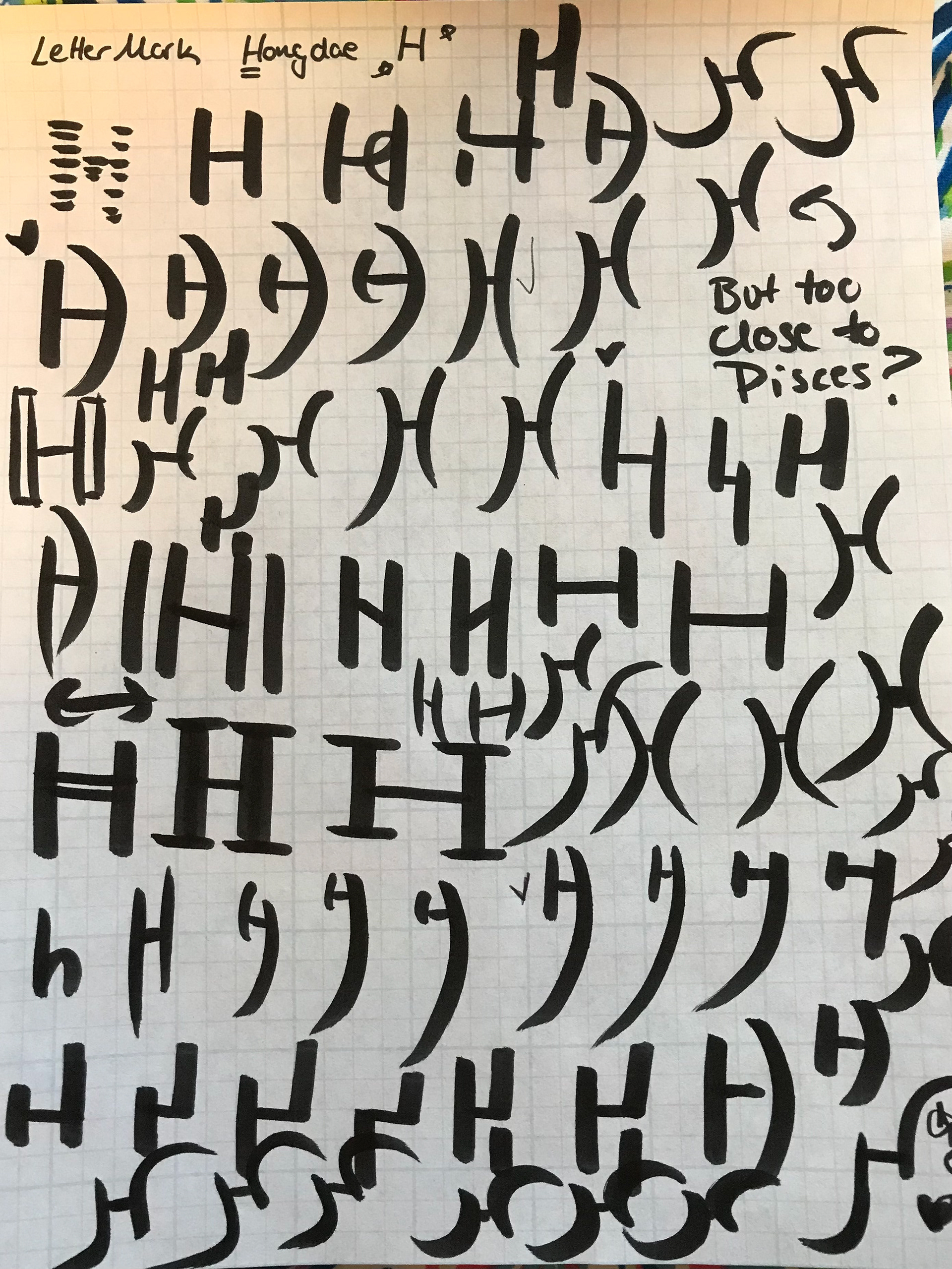
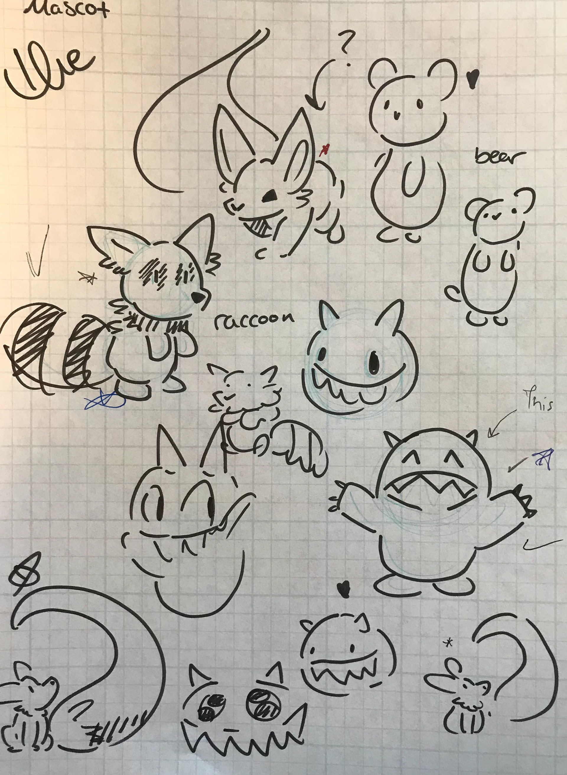
In my sketches, there are a variety of different logos. I was encouraged to experiment with every type of logo such as mascot logos, wordmarks, emblems, and more. Each page of sketches was ideation dedicated to each logotype. This exercise taught me not only the importance and usability of each logotype but the flexibility these logos can undergo as well as the importance of catching and keeping the audience’s eye. I picked designs from each type of logo and pushed the idea further in Adobe Illustrator.

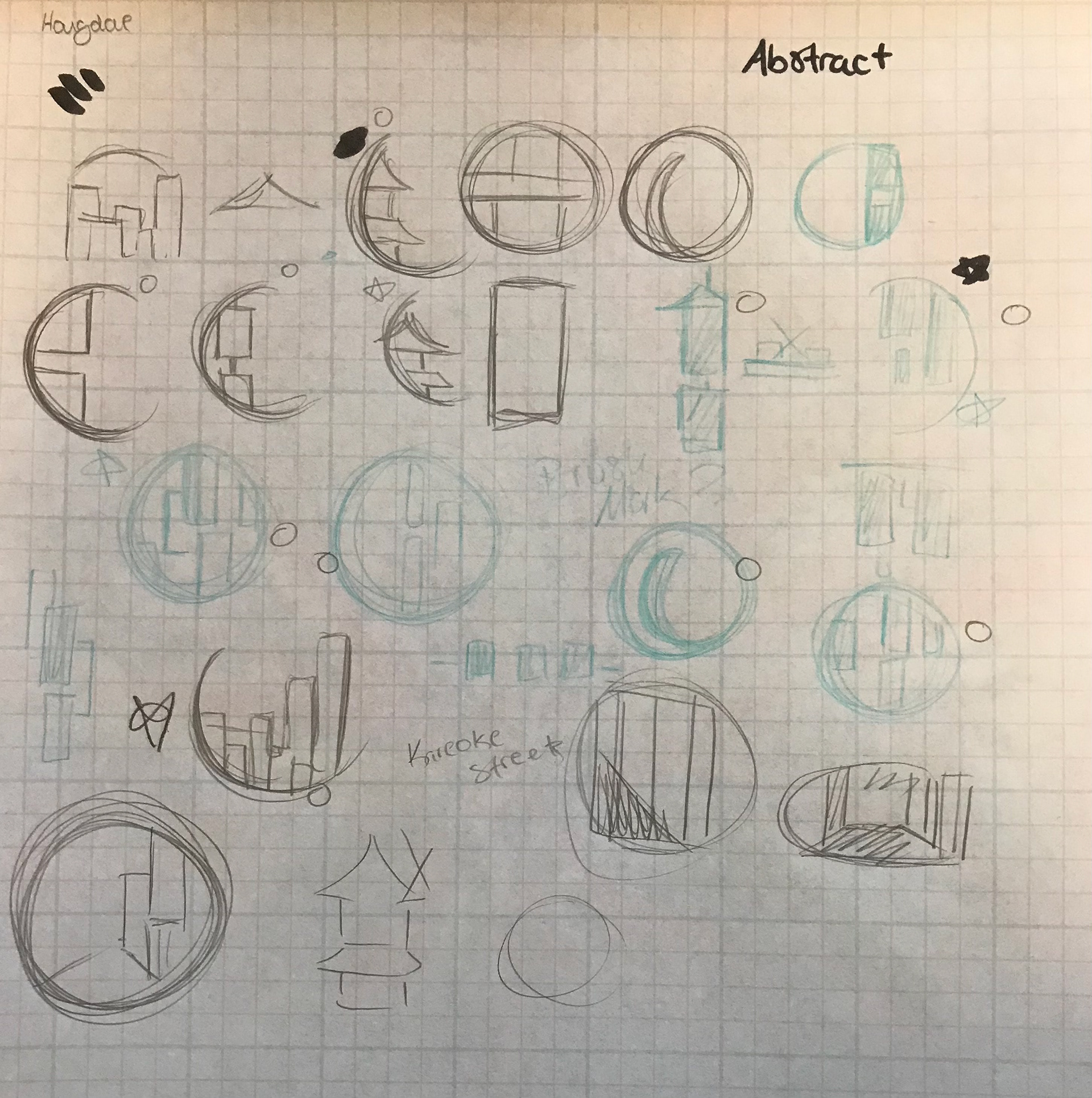


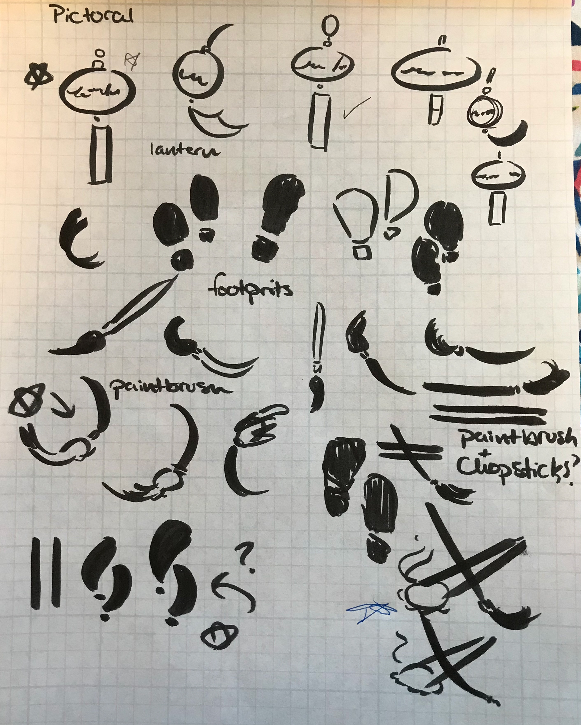
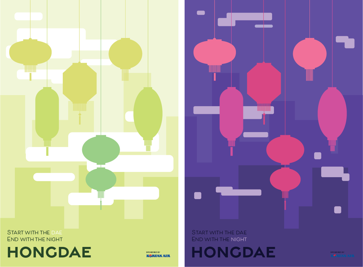
From here, I chose lanterns to be a constant throughout my advertisements and began to experiment with colors to match the tagline and to emphasize the day and nightlife of Hongdae.
In-Progress
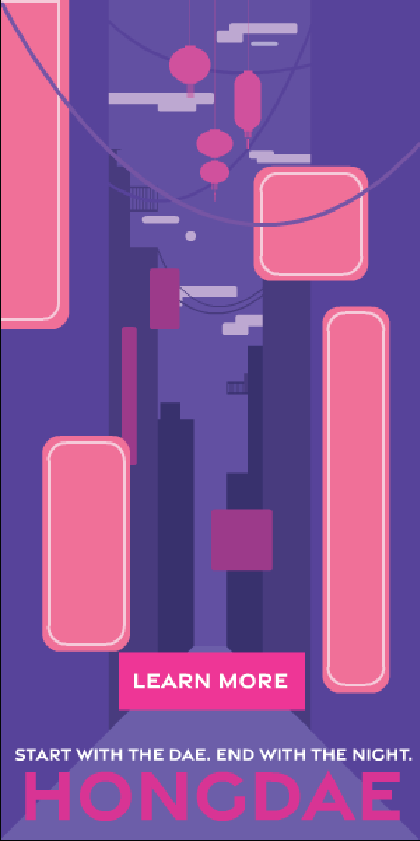
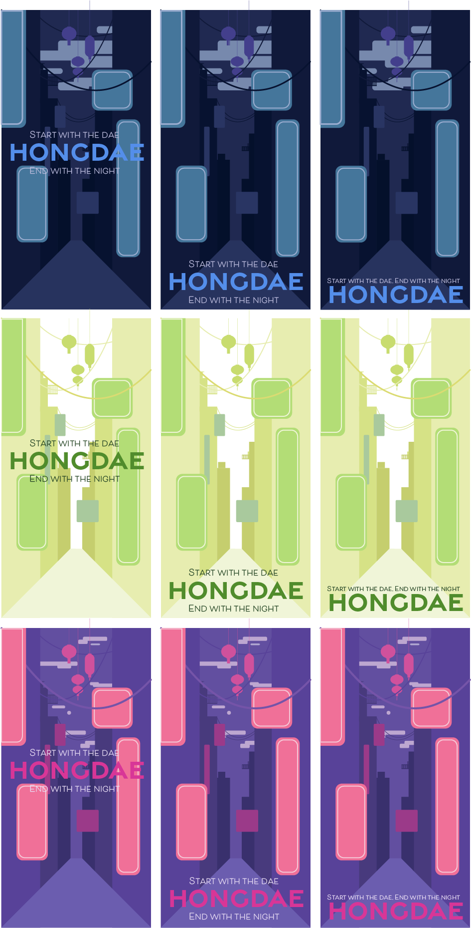
I decided to design two versions of each advertisement: one using a day or morning color palette, and the other using a nighttime color palette. My designs were inspired by monochromatic landscapes and illustrations. As seen in my compositions, I wanted to create a scene of a cityscape and an alley for my posters and web advertisement, respectively. I pushed this idea to add depth to my designs and to have the viewer’s eye be guided through the piece. As for fonts, I went with a clean, bold sans-serif font to increase legibility against the illustrative design and to match the country’s written language, Hangul.
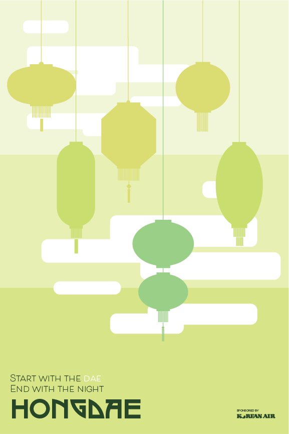
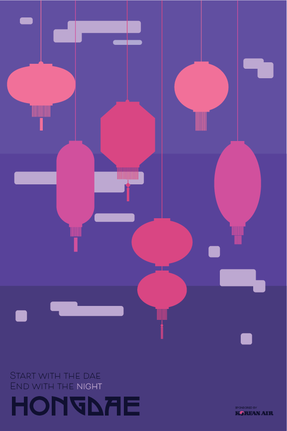
In addition to posters, I was to create web advertisements for the advertising campaign as well. I wanted to add perspective to the piece by illustrating the busy streets of Hongdae. I experimented with the day and night color pallets I created, as well as monochromatic blues. I decided to use both the day and night color schemes and animate the advertisement transitioning from day to night.
Final Piece
Below is the final branding and style guide for the Hongdae advertising campaign.
