Neon Alley - Short Comic
Comic
Procreate
Overview
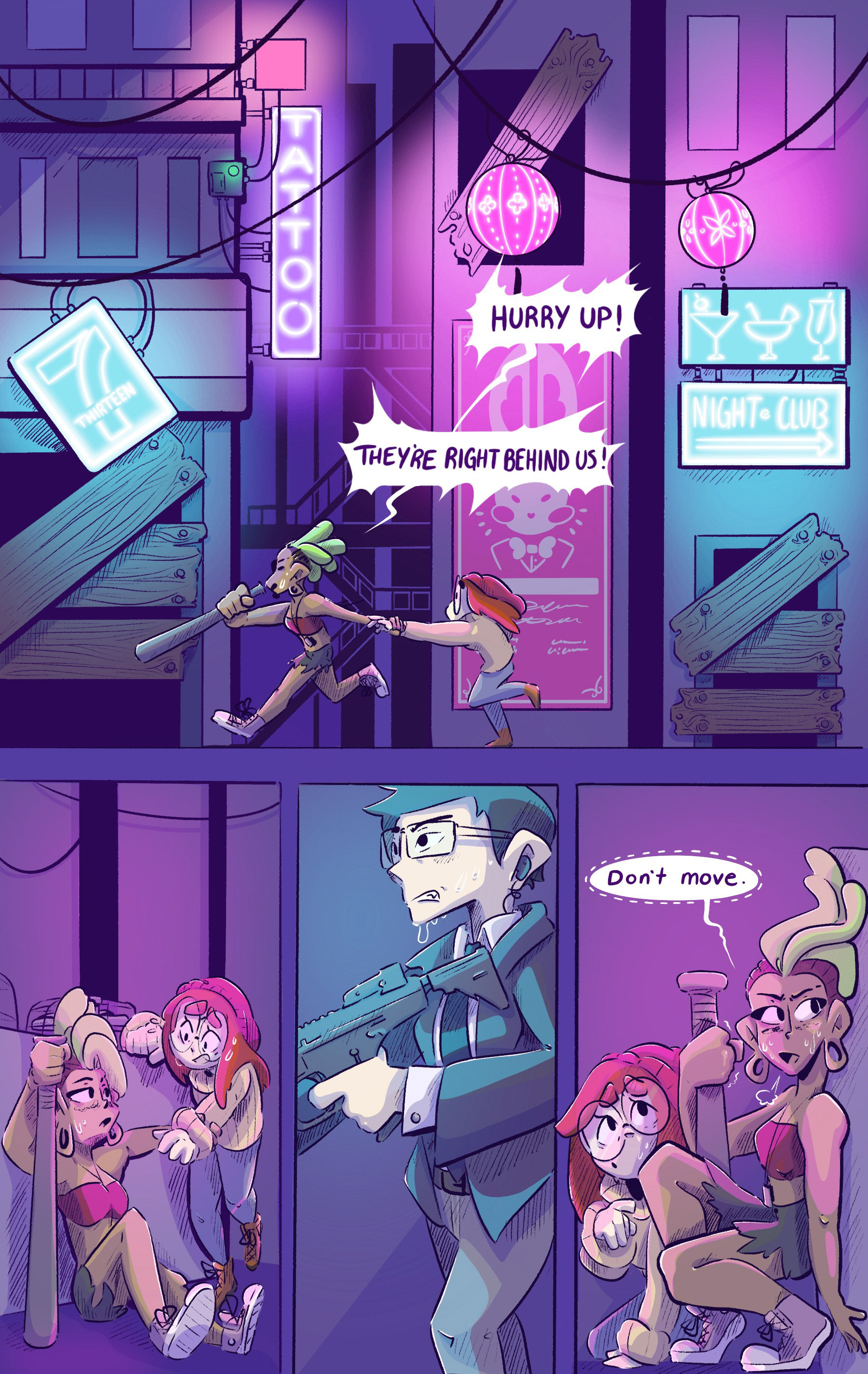
To showcase what I learned about visual storytelling, I was to create a short five-page comic that would act as a hook to the audience. The brief detailed the use of contrasting characters, a choice between a sci-fi, fantasy, or romantic narrative, and various perspective shots used throughout the comic. With these guidelines, I wrote a summary for each genre and was advised by my professor to run with the sci-fi story.
Sketches
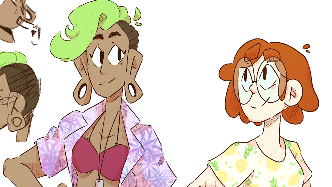
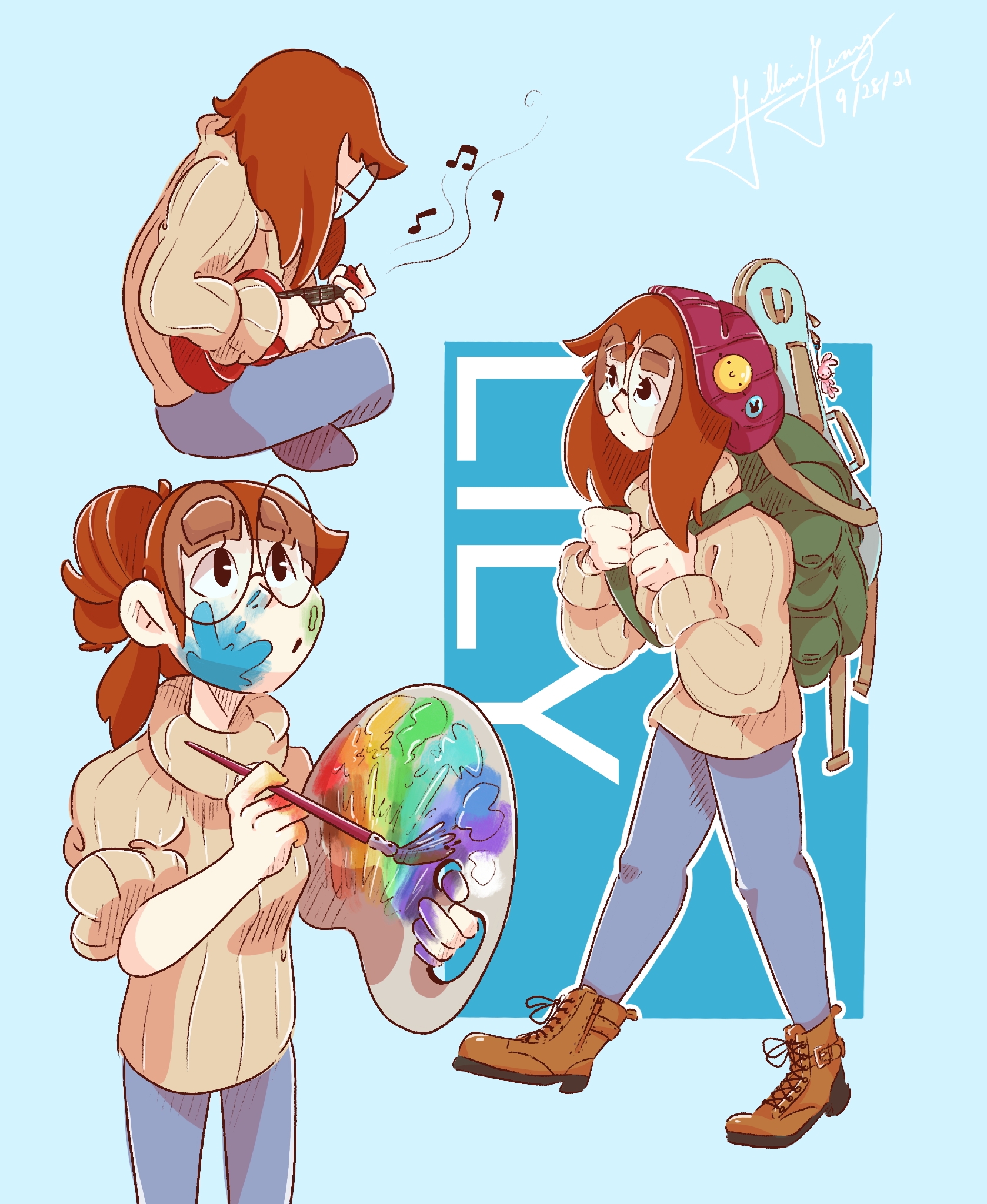
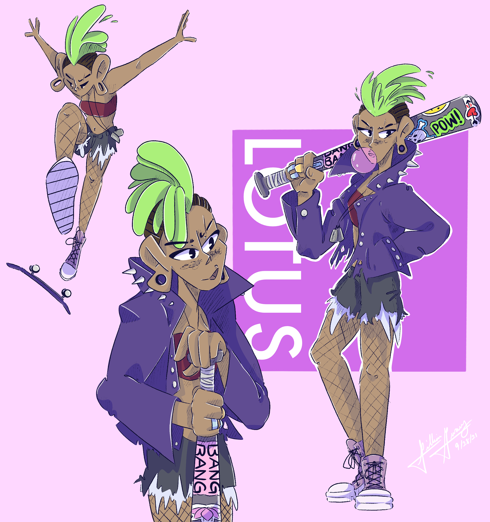
The character creations were completed earlier in the course. The assignment revolved around creating foils, characters that differ from each other in personality, ideals, and outward appearance. I first explored contrasting character traits, such as being confident and shy, athletic and creative, urban upbringing, and small neighborhoods. Thus, I created Lily and Lotus. Constants in Lily’s design were large glasses, short stature, a heavy backpack, and a beanie. She is quiet and shy which is also reflected in how she dresses. Lily is drawn with rounder shapes and muted colors. Constants in Lotus’ design were a mohawk, a metal bat, tall lanky stature, and gauged ears. She is a colorful, loud, punk who is always getting into trouble or making trouble. Lotus’ design incorporates bright saturated colors and harsh lines.
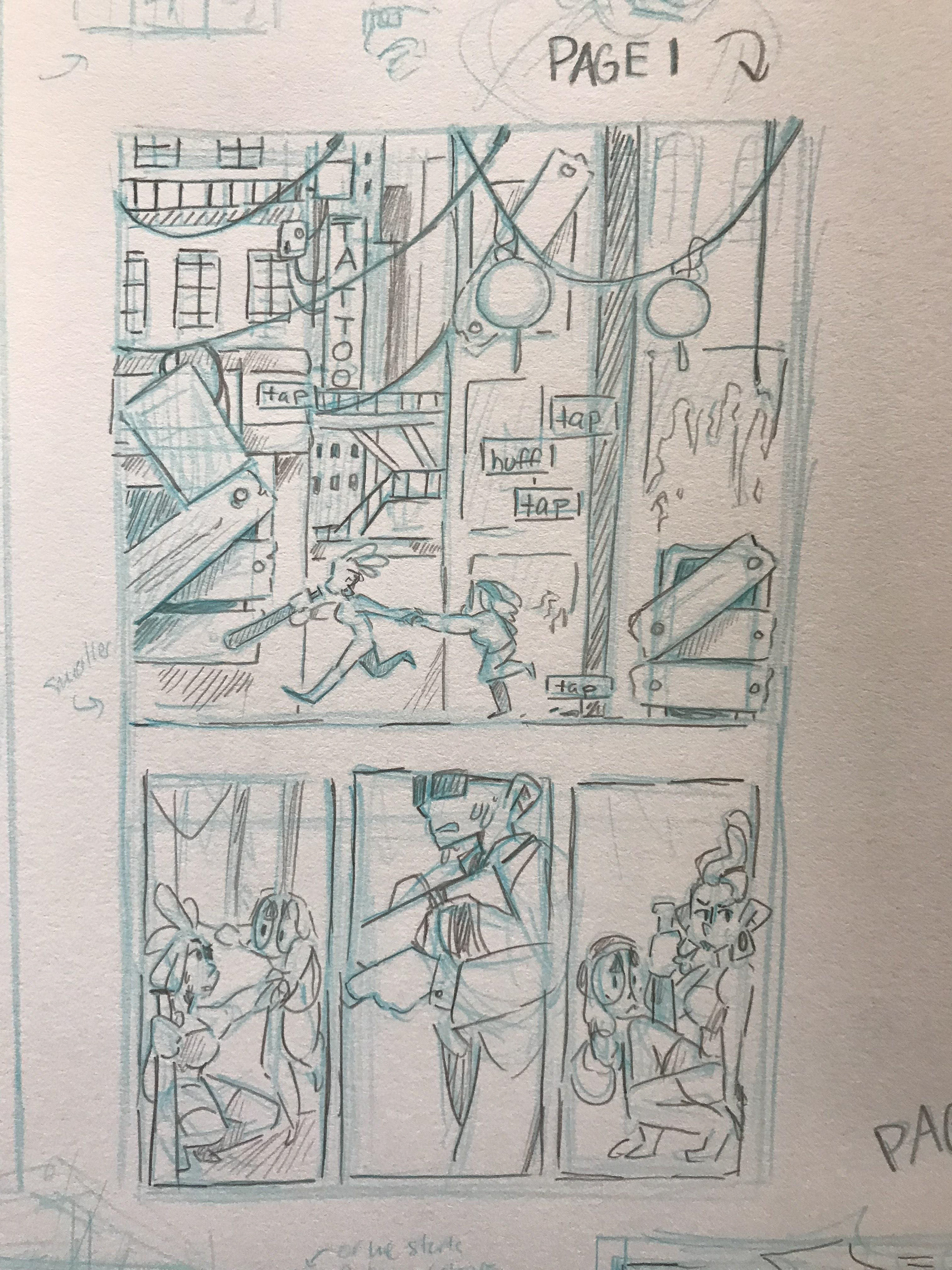
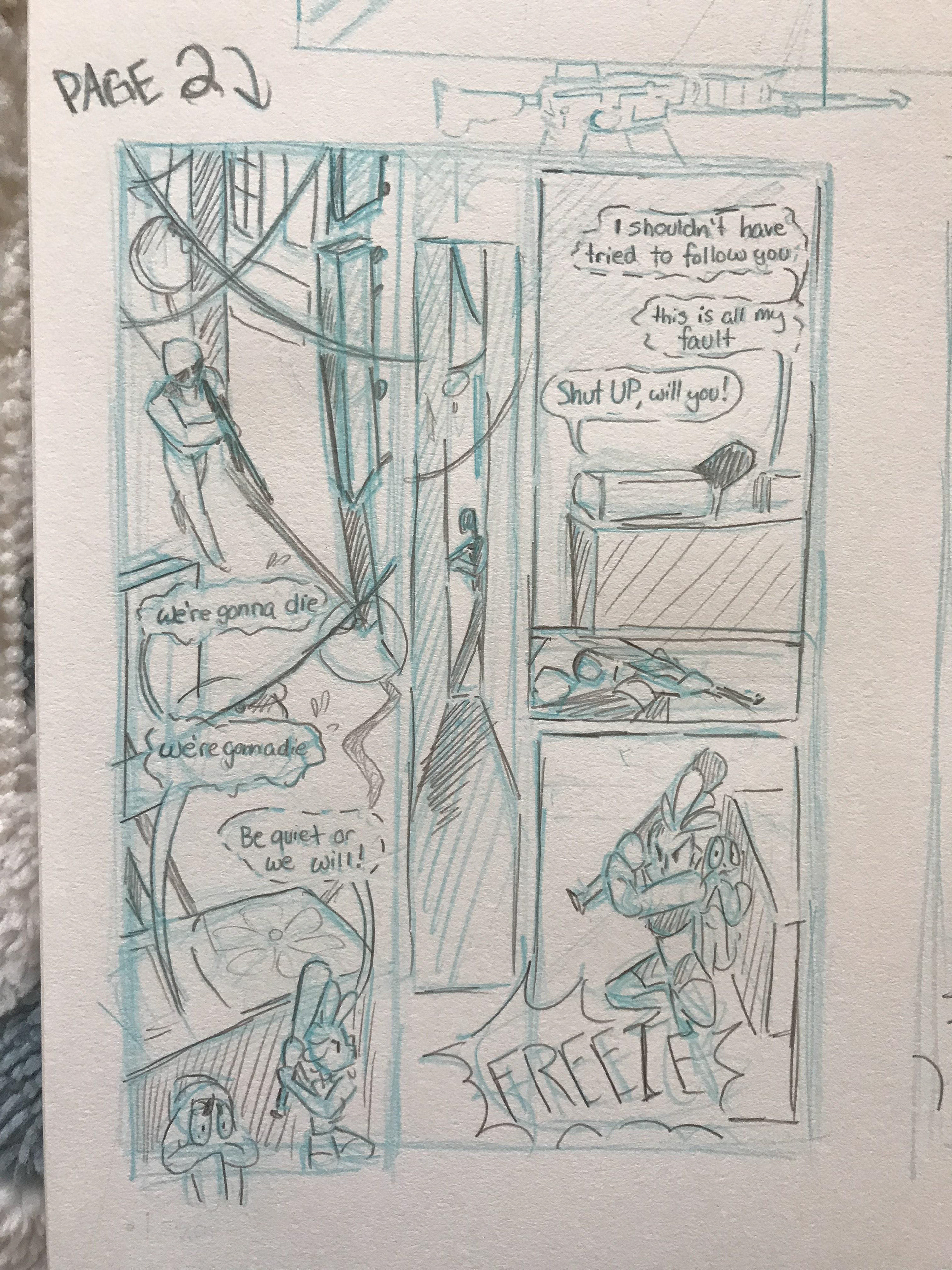
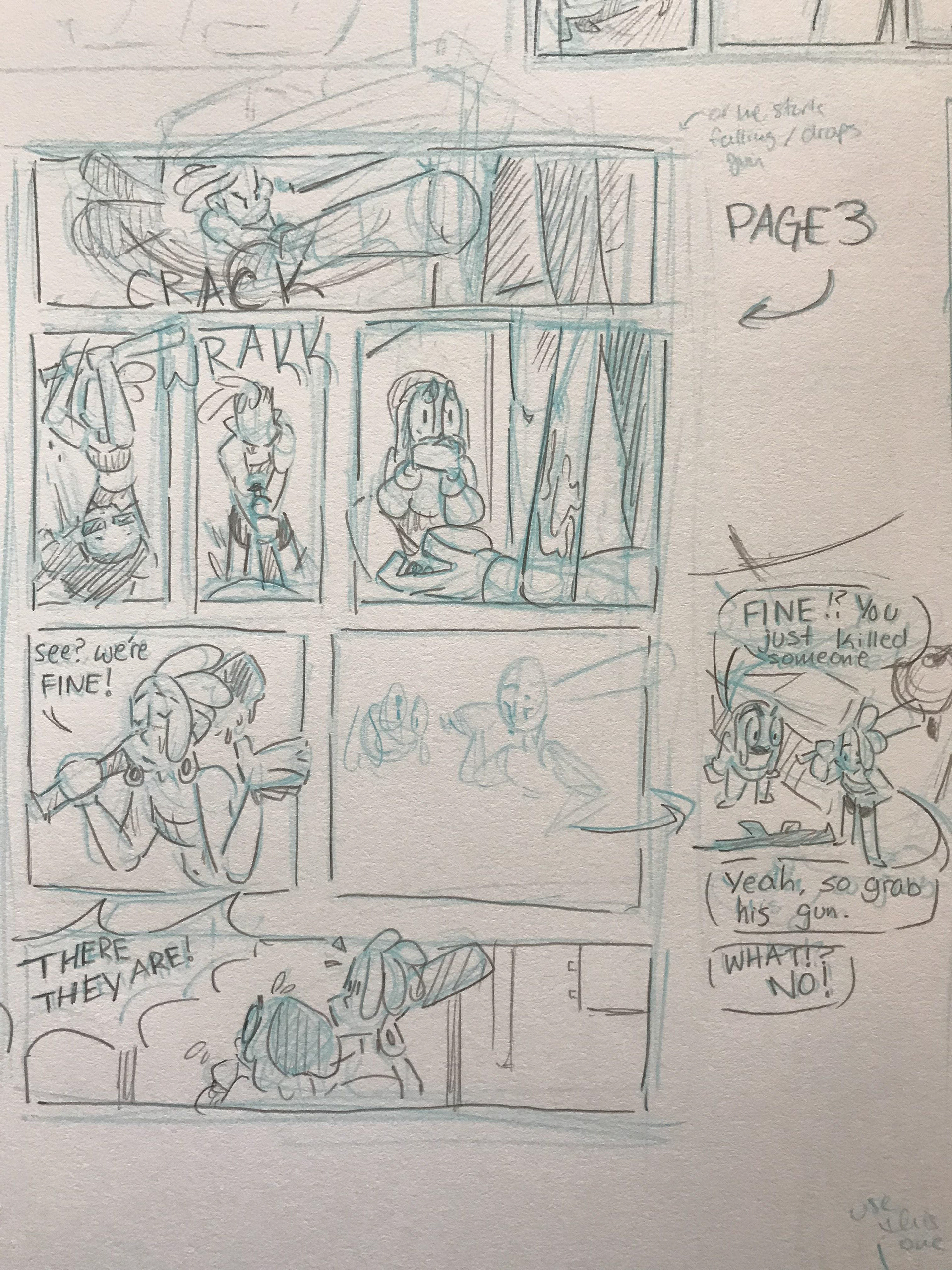
My approach when creating each comic page’s composition was to visualize interesting panels. When reading my short script, I would draw a specific moment in the narrative that stood out to me, then figure out how to connect the visuals from moment to moment. I wanted to push the camera angles and perspectives as well to create visually interesting comic pages. Then, with these visuals, I would rearrange their position to fit panels that would help guide the reader’s eye.
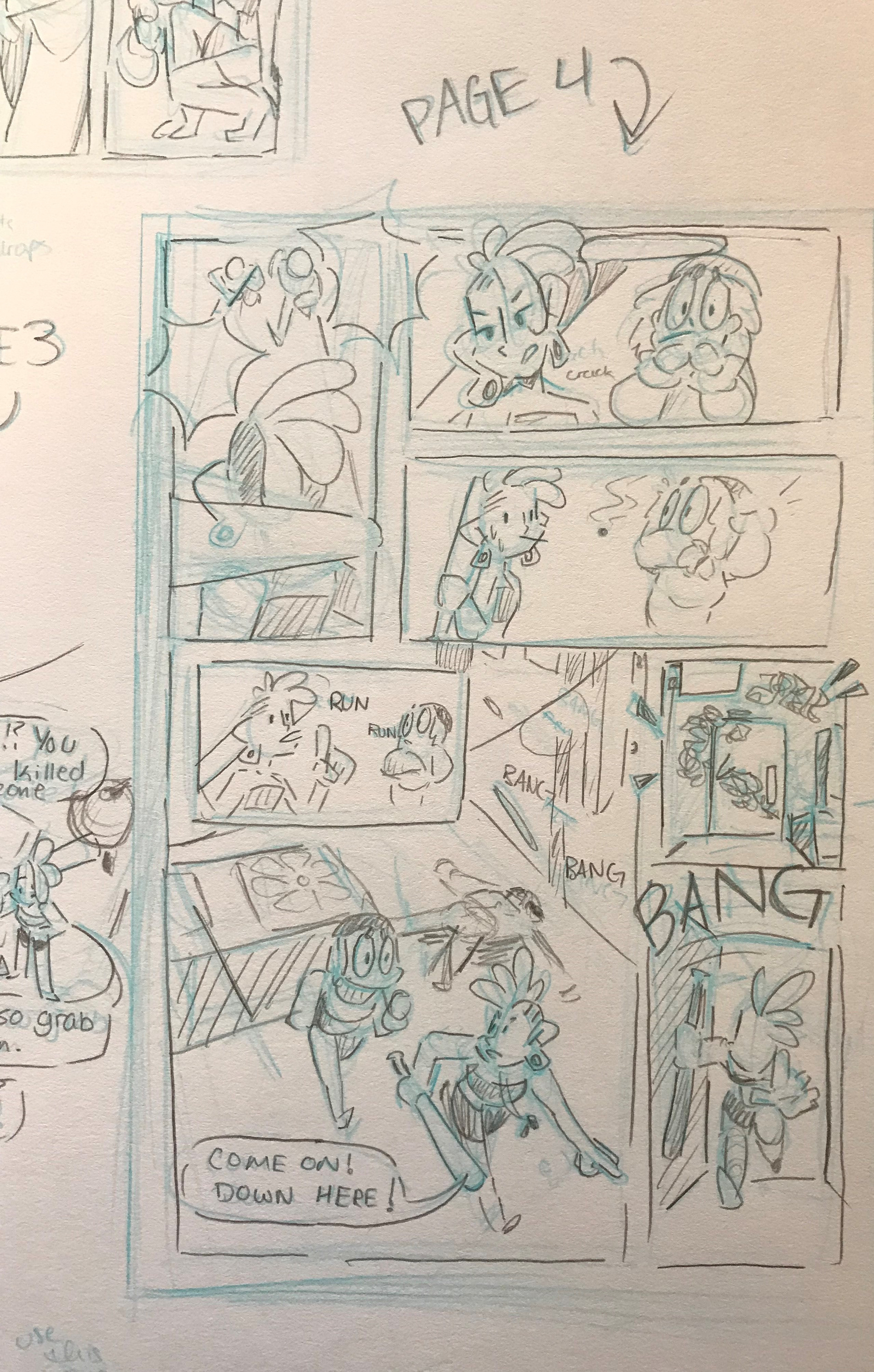
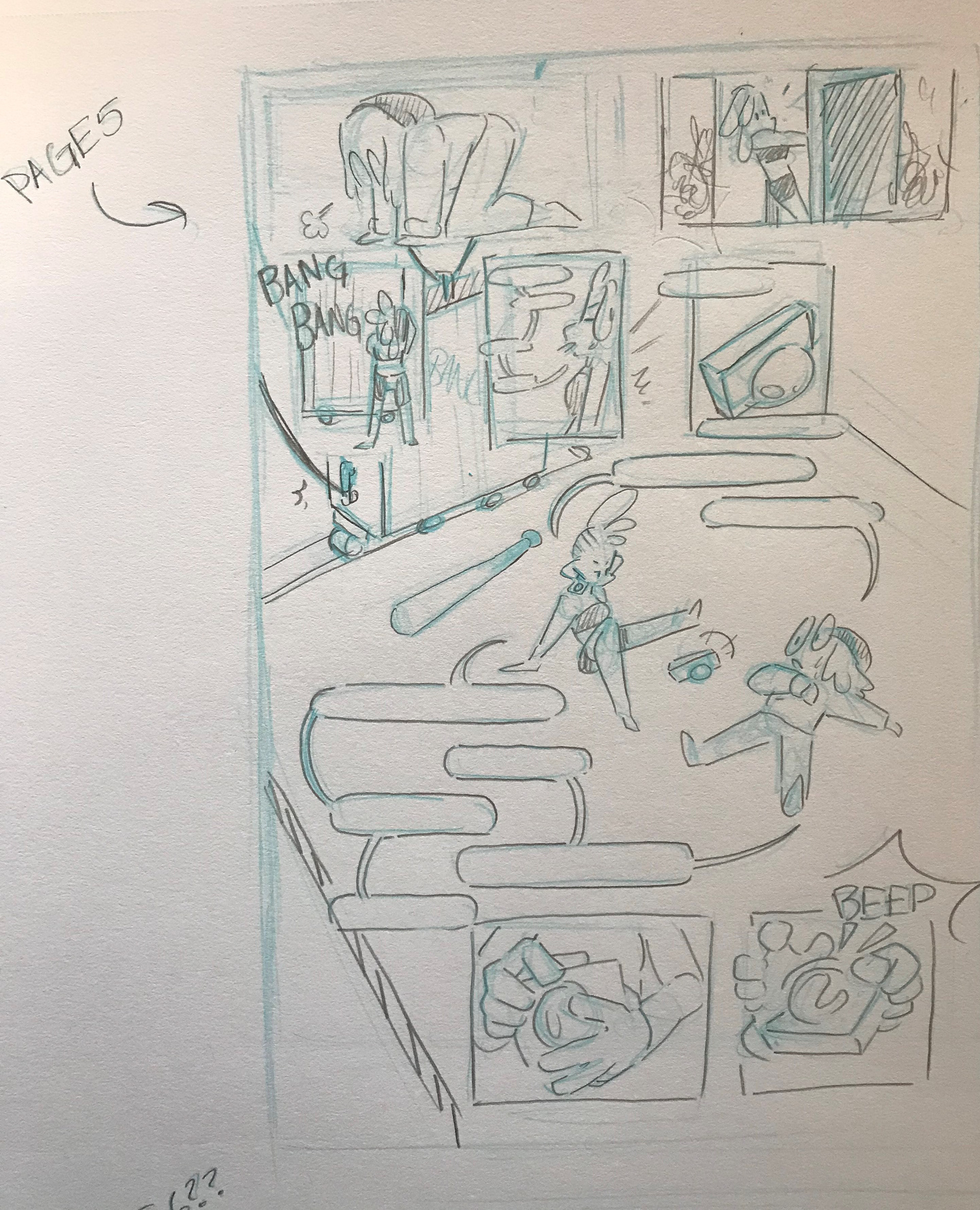
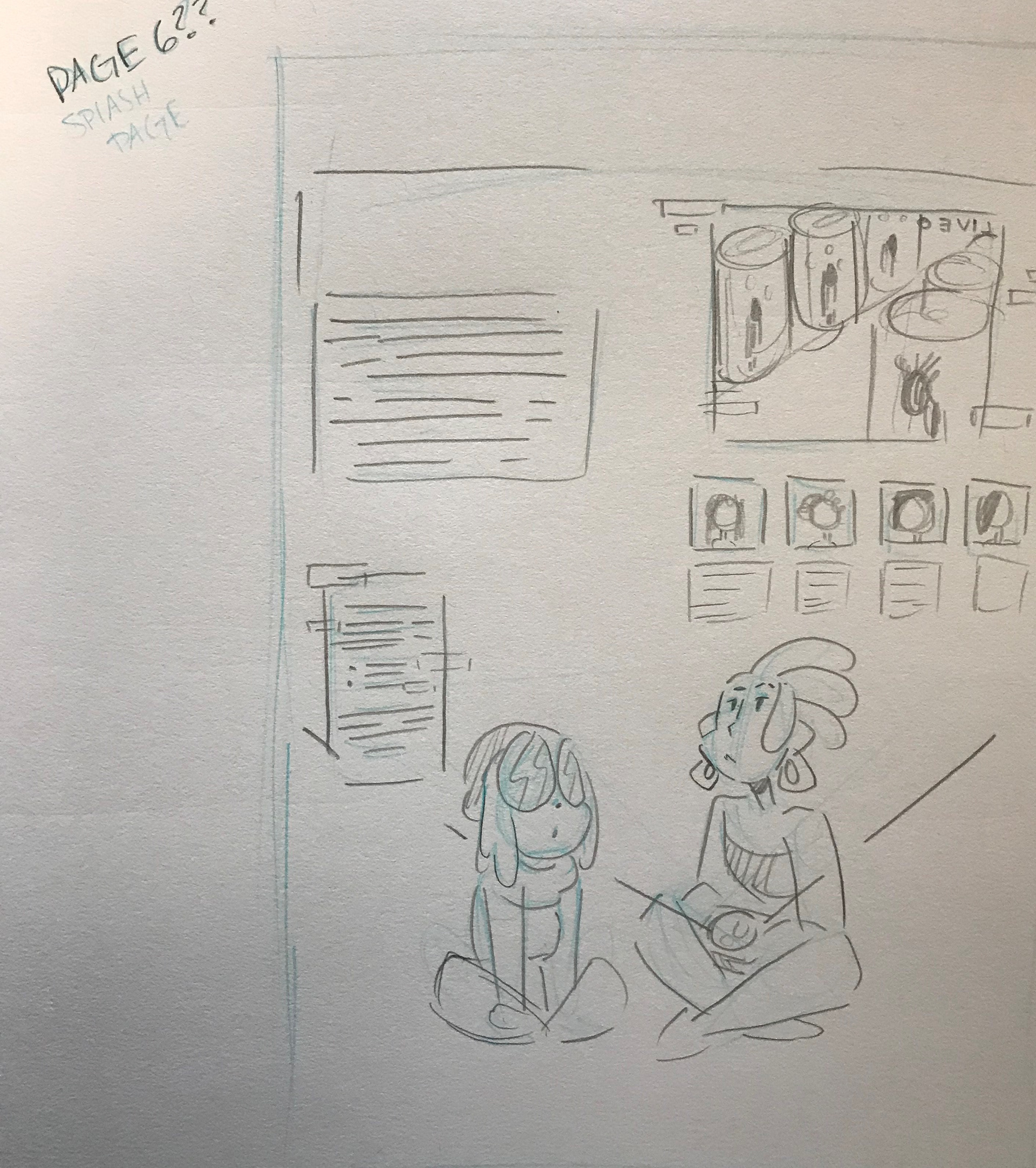
In Progress
Happy with my sketches of each page, I imported them into Procreate to start inking. I chose a textured brush to add a gritty feel and a hand-drawn quality to the comic and added some cross-hatching to add texture to the shadows. In this stage of the project, I also focused on adding more detail and depth to the backgrounds in contrast to my sketches. I wanted elements of the character’s environment present in each panel, whether that’s reflected through objects or color and lighting. I also wanted to break the panel frame when I could. I enjoy elements like this in comics I read and wanted to incorporate them into my comic.
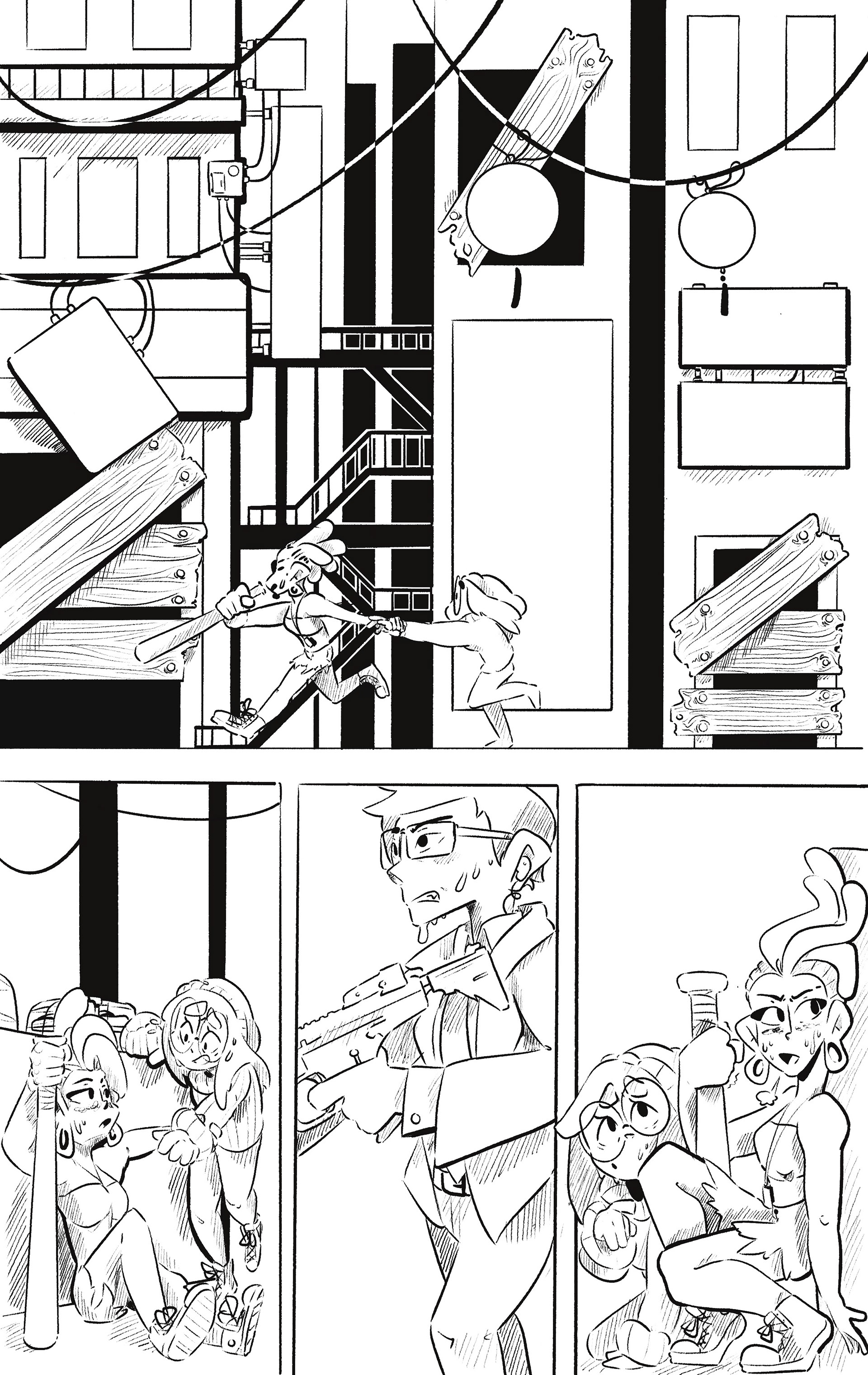
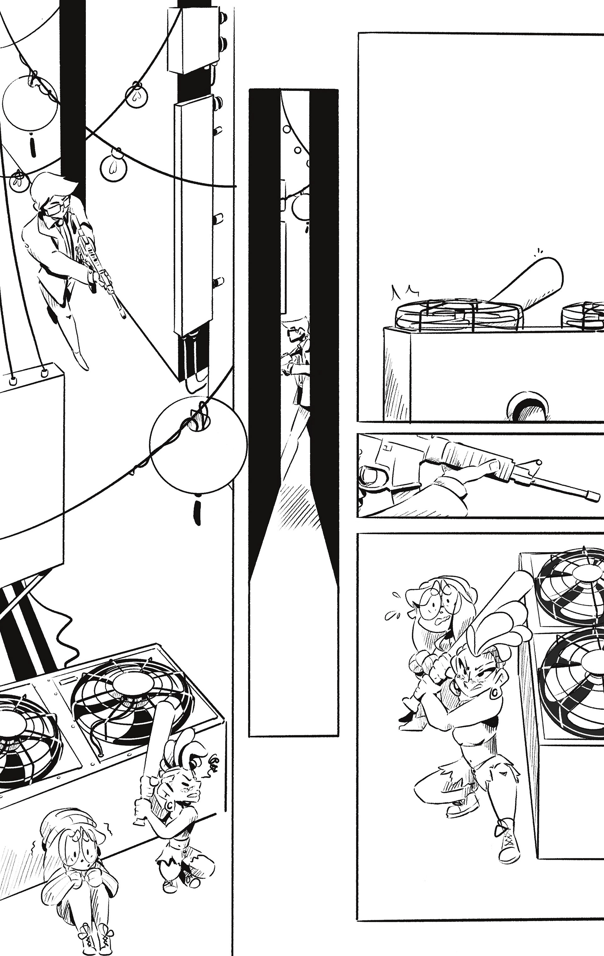
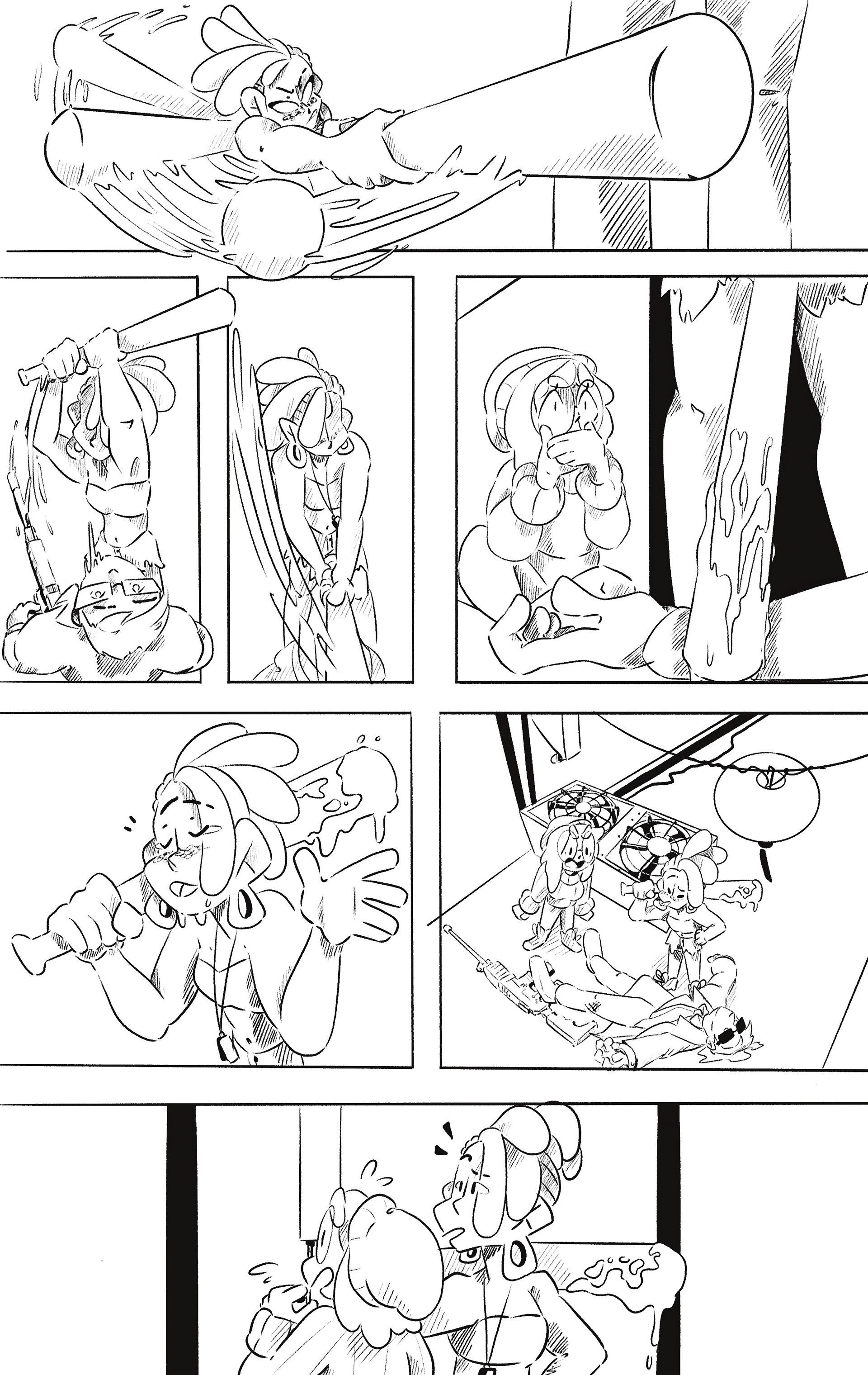
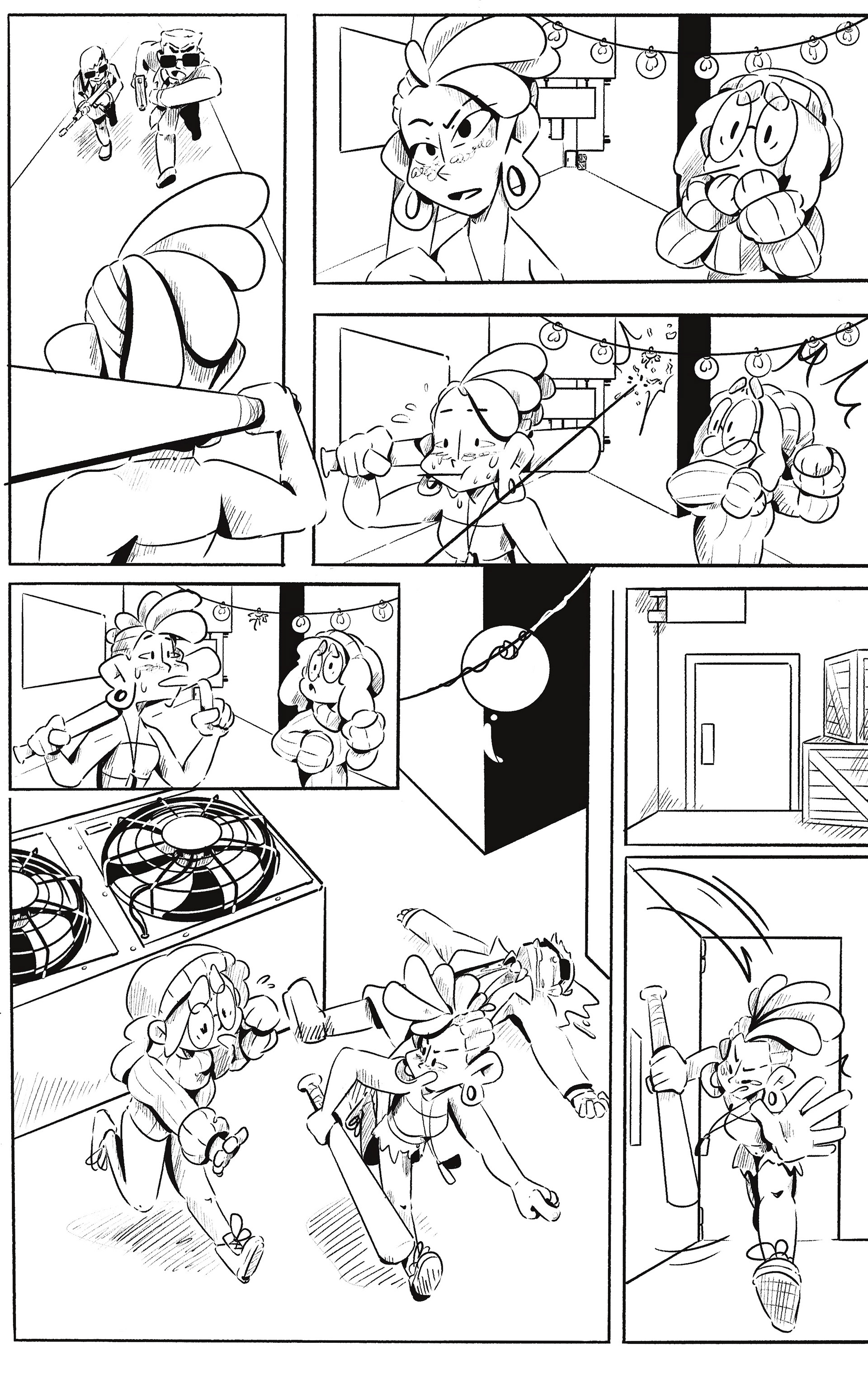
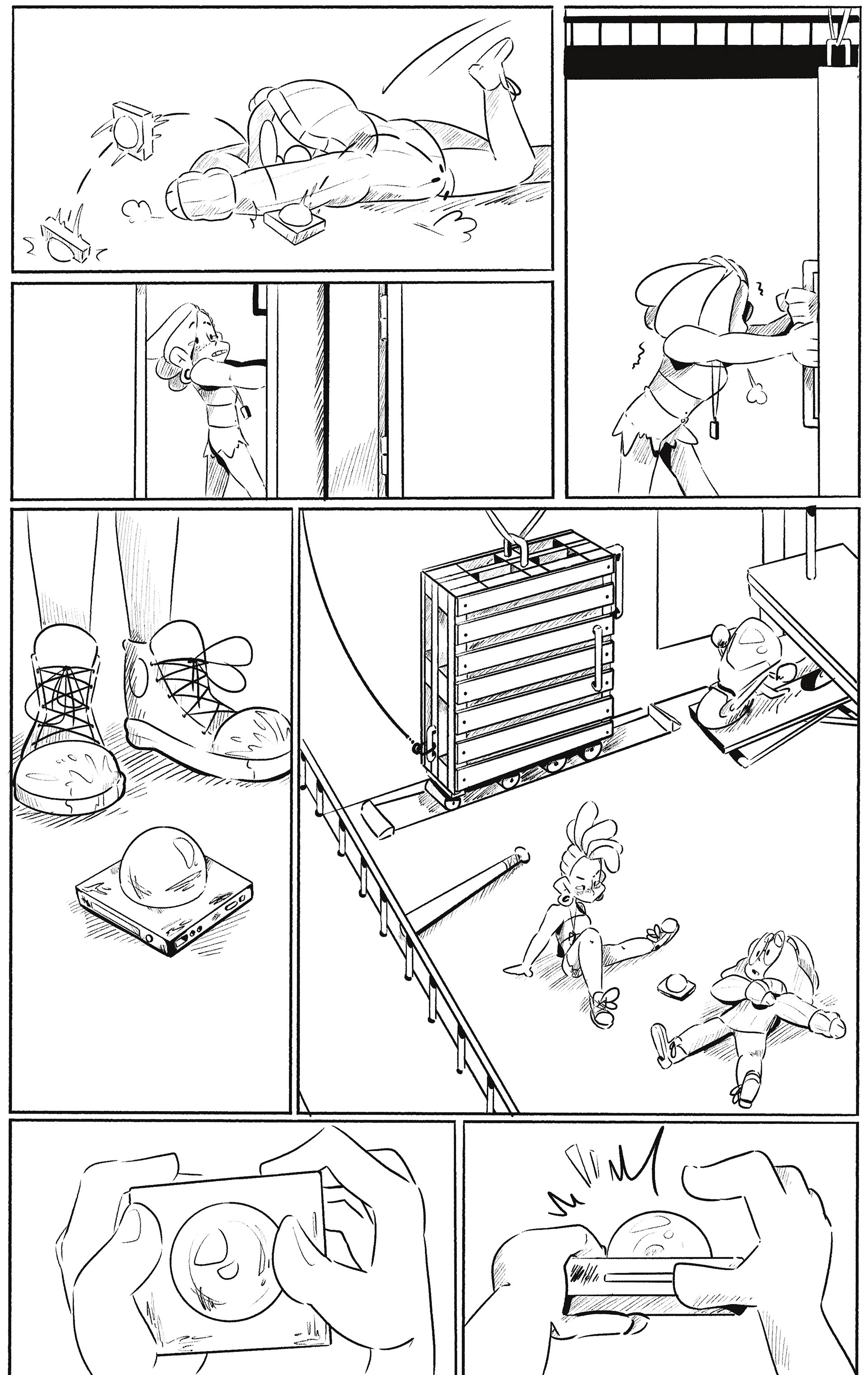
Once the inking was complete, I moved on to coloring each page. I first added flat colors to the entire page, making sure the environment’s palette fit nicely together and that the characters' colors matched their character sheet. Then I used a multiply layer to add shading to the characters and environment. Since I planned to include a multitude of different light sources, the shadows would have to be heavier and placed opposite from the lights. To add light to the piece, I used an airbrush to give a glowing effect on an overlay layer to further brighten the elements. In certain elements, I used a light brush that further pushed the lighting effect.
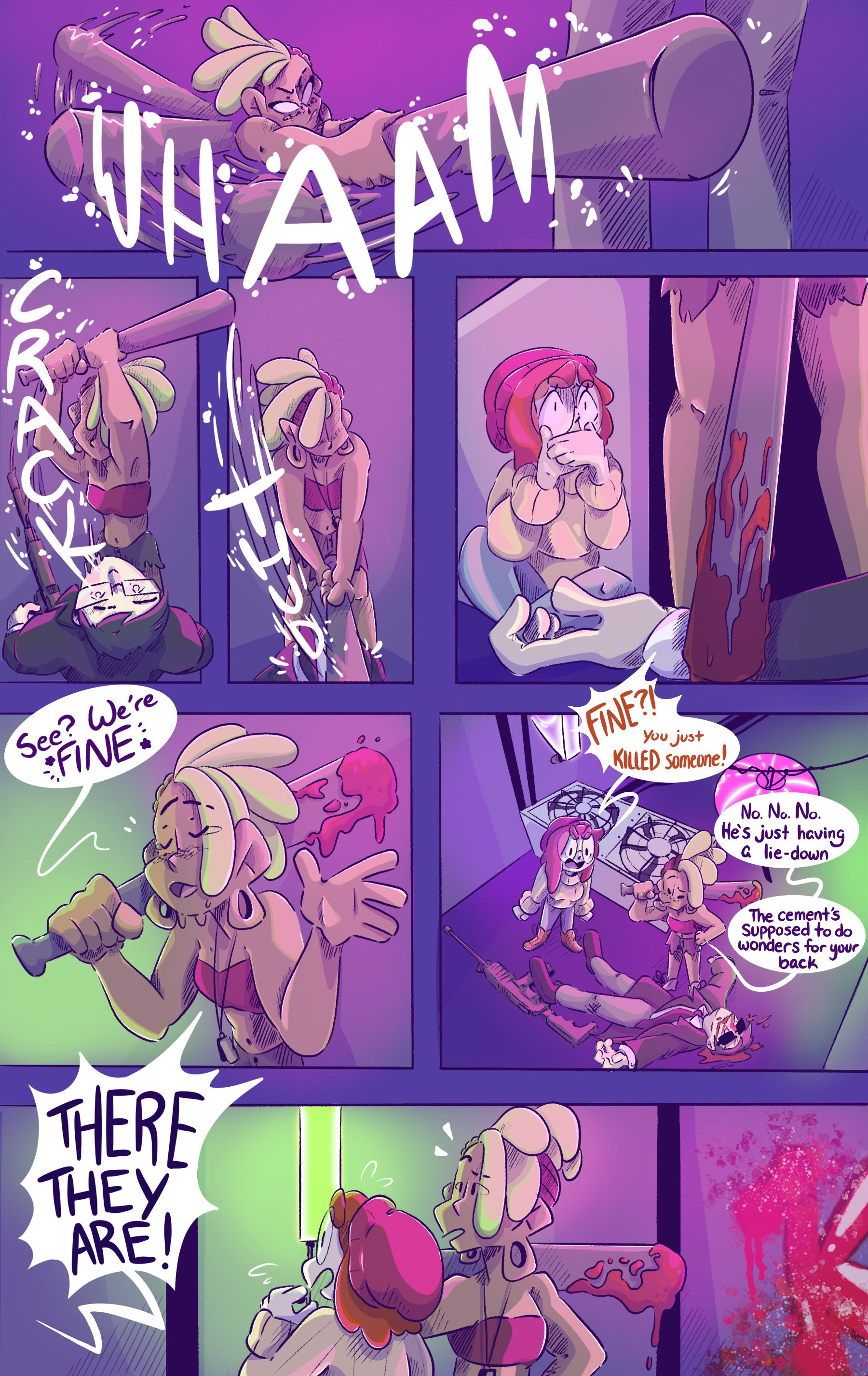
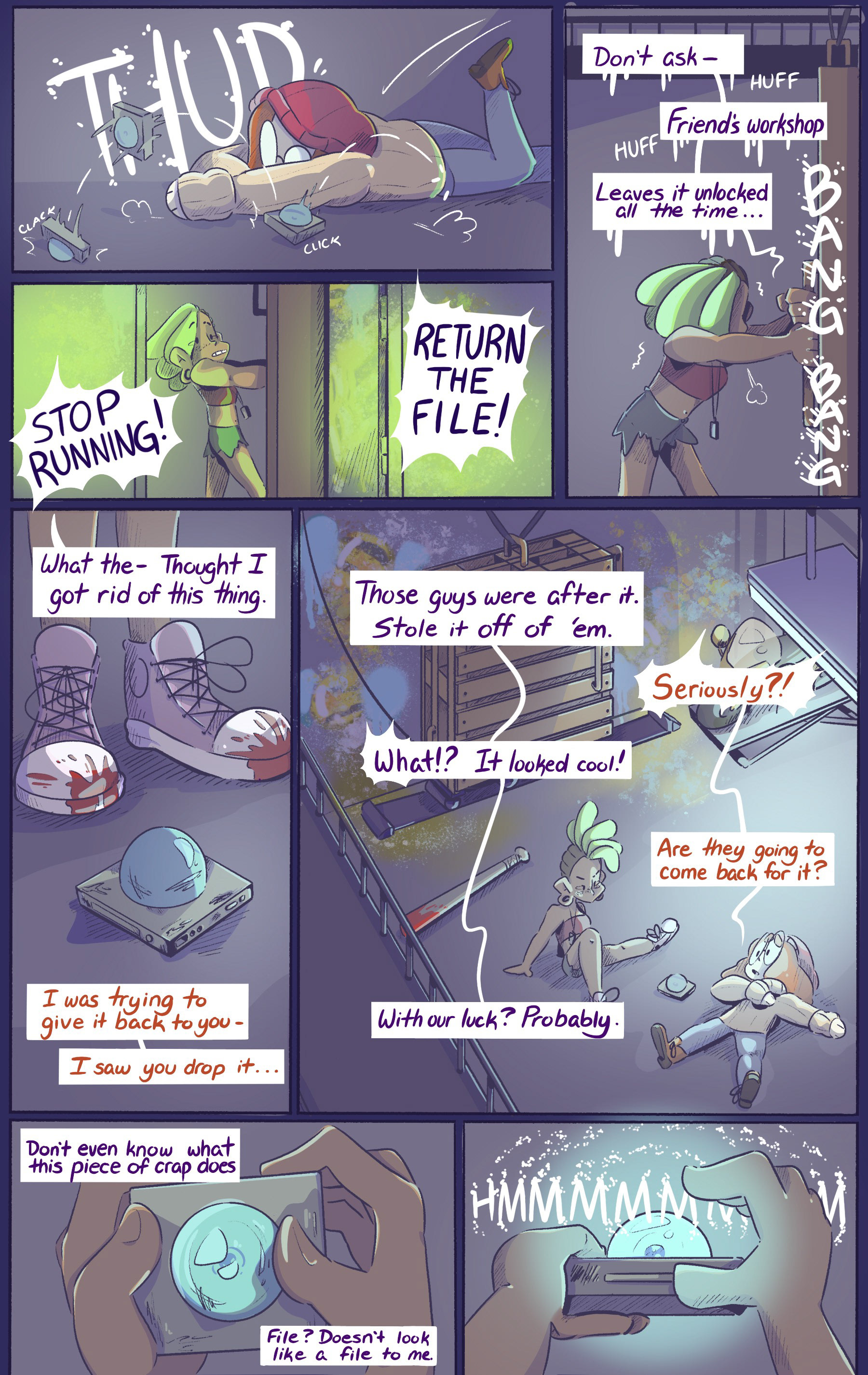
When adding the word bubbles and onomatopoeia to my comic, I wanted to stylize each element to match the tone of the dialogue or the direction and sound of the onomatopoeia. As seen in my comic, Lily and Lotus’ word bubbles contrast each other’s. Lily’s words are frightened and wobbly compared to Lotus’ exclamations to keep them safe.
With the onomatopoeia, I wanted the text to move with the actions; to be foreshortened to increase the motion and movement in the illustrations, and to break the panel framing as well.

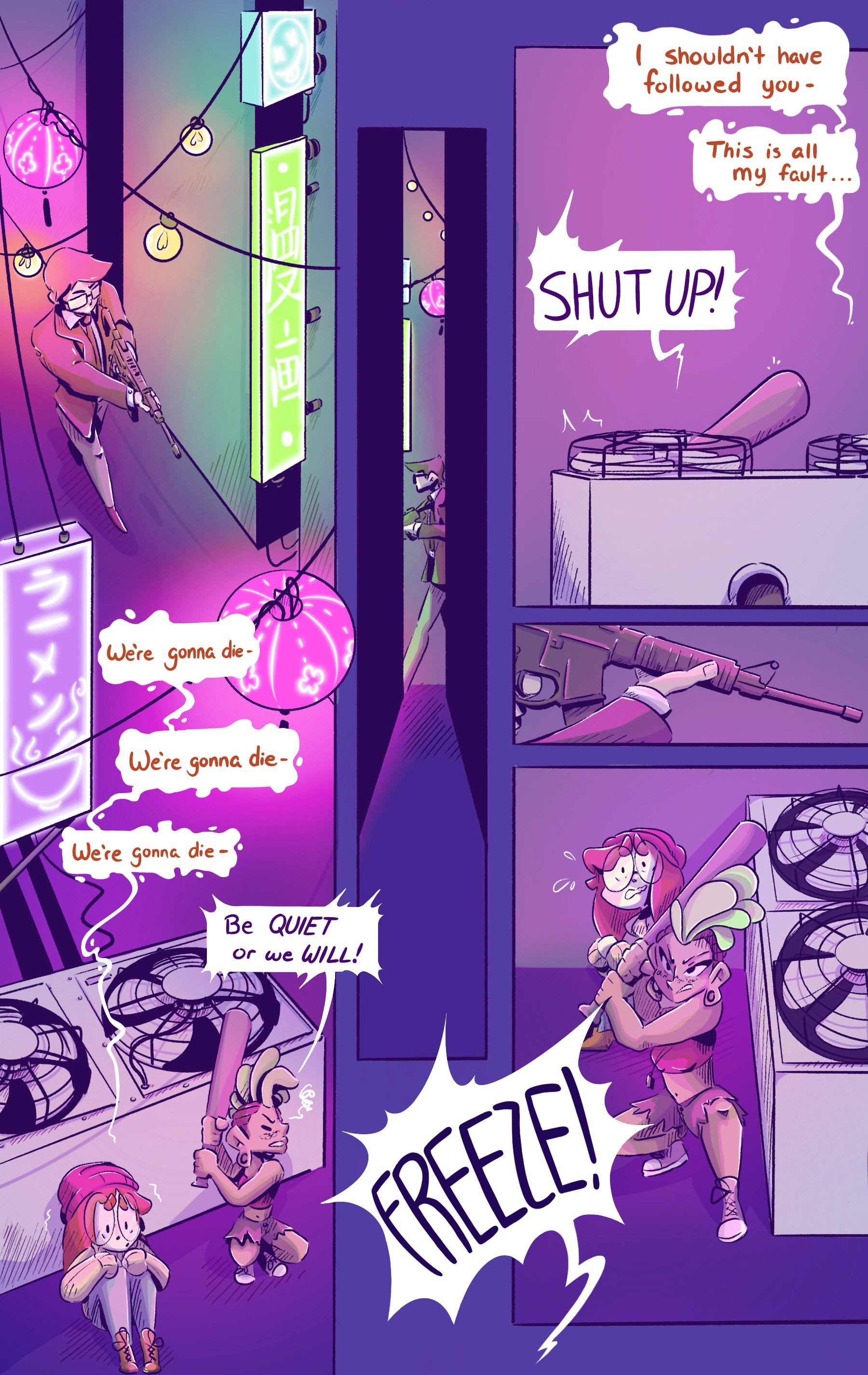

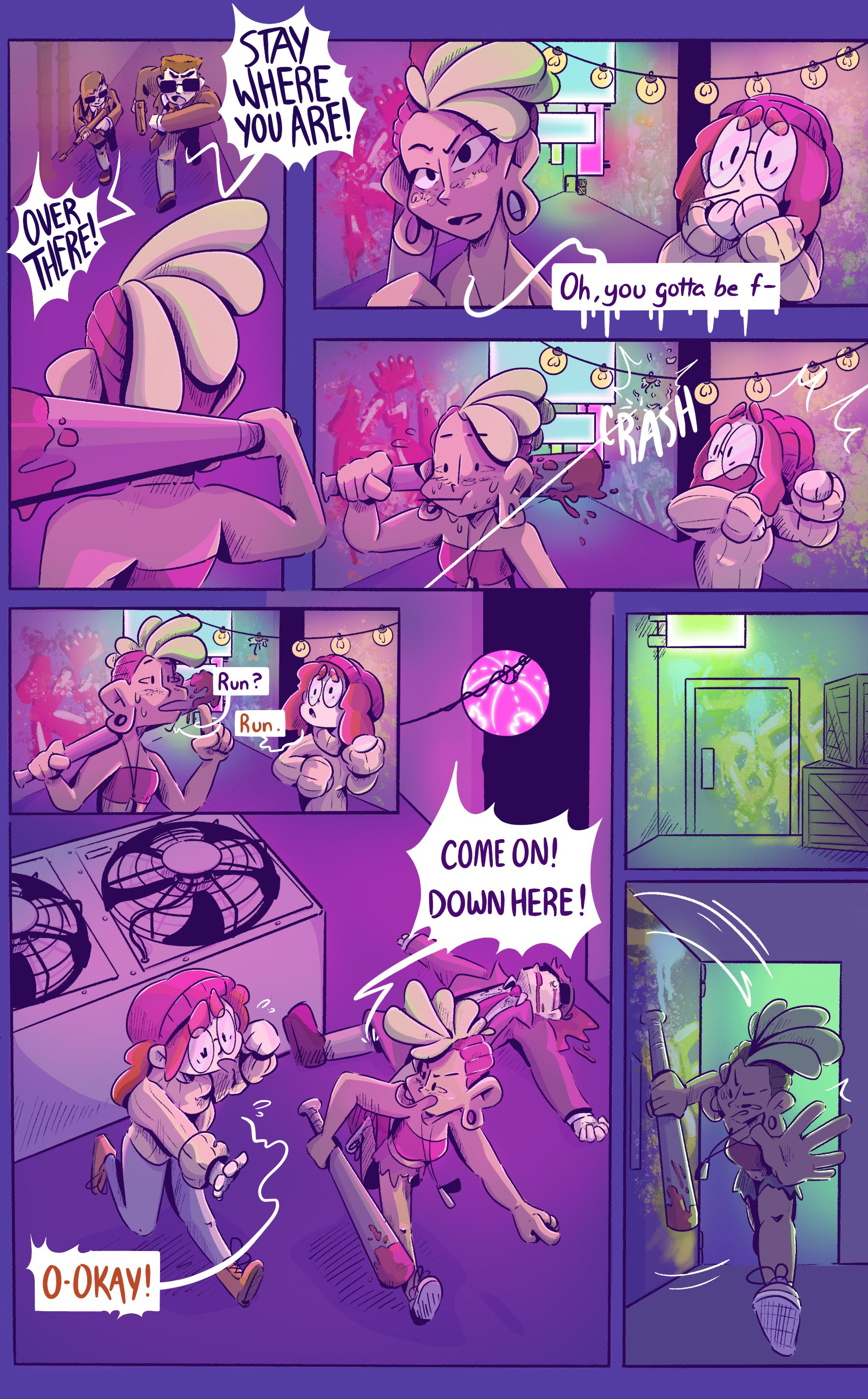

Final Project
Below is the final five-page comic.
